Building Low-Maintenance Reporting Pipelines in Power BI
Over the last few years, I’ve built reporting for a surprisingly wide range of operational needs.
Highspot digital room analytics. Support case reporting. Workday training completion tracking. Subscription analysis. Leadership KPI dashboards. Quarterly operational summaries.
Individually, none of those reports felt especially complicated.
Collectively, they created a surprising amount of maintenance.
Early on, I spent most of my attention on the dashboards themselves. That’s where reporting projects tend to focus: visuals, measures, layouts, filters, and user experience.
Over time, I found myself paying more attention to everything surrounding the reports.
Folder structures.
Naming conventions.
Source files.
Quarter rollovers.
Data cleanup.
Refresh behavior.
The reports were often finished long before the reporting process was.
When Reporting Becomes Operational
One example was quarterly Highspot digital room reporting.
The process worked.
Each quarter, a new report was exported, the source was updated, quarter filters were adjusted, the report was refreshed, and the results were published.
Nothing about the workflow was particularly difficult.
The challenge was that the same maintenance kept reappearing every quarter.
As more reports were added, those small tasks started accumulating. A few minutes here. A few minutes there. An adjustment that only needed to happen four times a year but existed across multiple reports.
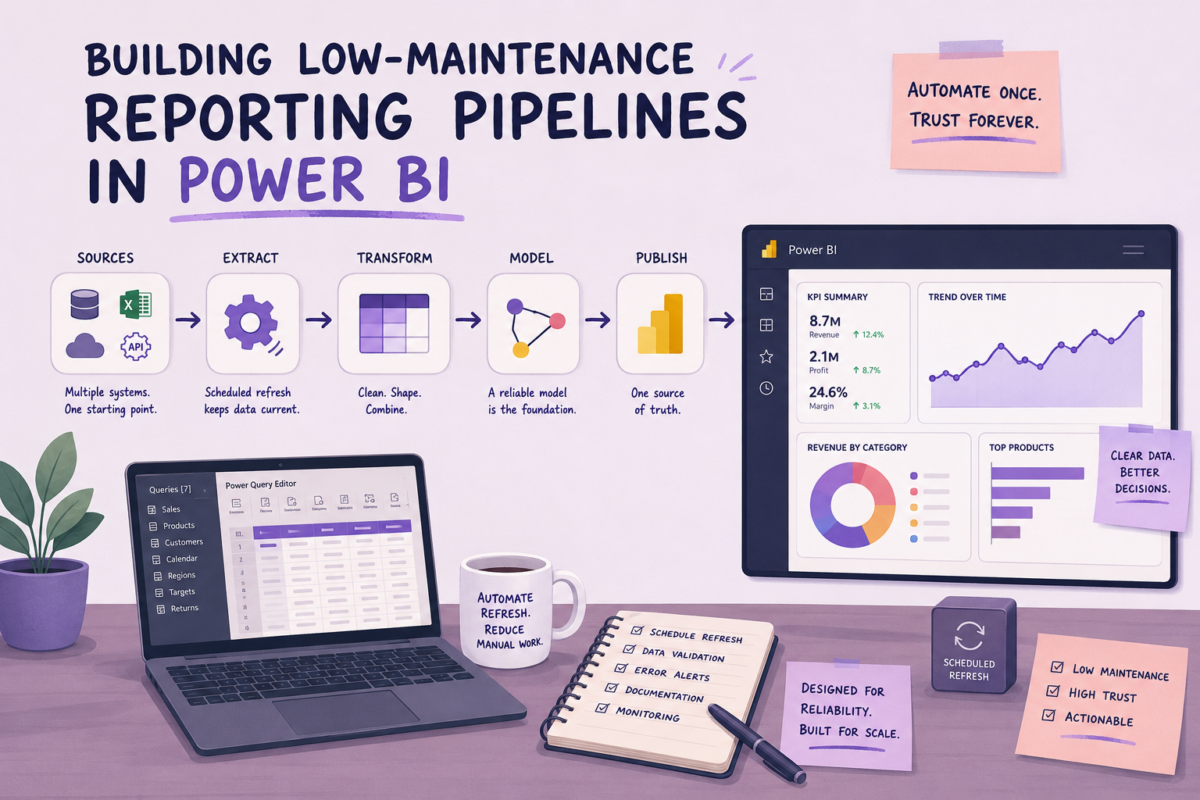
Eventually, I rebuilt the process around folder-based ingestion.
Instead of connecting Power BI to individual quarterly exports, the model connected to a SharePoint folder. Power Query filtered the files, standardized the structure, and combined the exports automatically.
The quarterly workflow became much smaller.
Export the report.
Save the file.
Drop it into the folder.
After that, the refresh handled the rest.
The improvement wasn’t dramatic. Nobody celebrated it. There wasn’t a visible change in the dashboard.
The reporting simply required less attention.
Those kinds of changes rarely make a report more impressive, but they often make it easier to live with.
Most of the Work Happened Upstream
I noticed something similar while building support case reporting that combined Salesforce data with Sage Intacct subscription information.
The dashboard itself wasn’t especially difficult.
Most of the effort went into preparing the data.
Product names changed over time. Different teams used slightly different terminology. Source systems evolved independently.
The reporting only worked consistently once those differences were accounted for.
In one case, support case counts suddenly dropped after a refresh. Nothing looked broken. The dashboard loaded normally and the visuals rendered correctly.
The issue turned out to be a product naming change that affected how data from multiple systems aligned.
Situations like that gradually shifted my attention upstream.
The more reporting work I did, the less I thought about charts and the more I thought about structure.
How are files organized?
How are products named?
How are dates handled?
What assumptions is the report making?
Most reporting projects eventually involve some amount of translation work between systems that weren’t designed together.
Moving Cleanup Into Power Query
Another pattern showed up in spreadsheet exports.
Many reporting processes begin with a file download and a handful of cleanup steps.
Remove totals rows.
Fix a date format.
Standardize a value.
Rename a column.
Save a cleaned version.
Repeat next month.
None of those tasks are difficult, but they create extra work every time the report runs.
As reporting matured, I moved more of those transformations into Power Query.
That made the process easier to follow later because the transformation logic lived alongside the reporting model instead of being spread across spreadsheets and manual preparation steps.
It also made updates easier when source files changed.
Small Improvements Matter More Than They Look
Some of the most useful changes I made felt insignificant at the time.
Quarter Index fields.
Dynamic reporting periods.
Consistent naming conventions.
Small Multiples.
Folder-based ingestion.
Automatic sorting logic.
None of these changes dramatically altered the reporting experience.
What they did was reduce the amount of ongoing maintenance.
Months later, reports continued moving forward without needing quarter-specific updates or visual adjustments.
Those improvements rarely stand out during development, but they tend to become more valuable over time.
Automation Where It Helped
I eventually incorporated Power Automate into parts of the reporting process as well.
The flows monitored SharePoint folders, validated uploads, triggered refreshes, and sent notifications when something failed.
I wasn’t looking for opportunities to automate everything.
Usually I was trying to simplify a process that had gradually accumulated extra steps.
Reporting systems have a tendency to collect small pieces of maintenance over time. A folder here. A file replacement there. A reminder that someone has to remember every quarter.
Removing a few of those steps often had a bigger impact than adding a new visual or metric.
What I Started Paying Attention To
One thing that changed over time was how I evaluated reporting projects.
I still cared about the dashboard itself, but I found myself paying closer attention to the process surrounding it.
How much effort does this require next month?
What happens next quarter?
How easy is it to update?
How many manual touchpoints exist?
Those questions started influencing design decisions as much as the visuals did.
The reports that seemed most successful weren’t always the ones with the most sophisticated dashboards.
They were often the ones that blended into normal operations and quietly continued working.
Final Thoughts
Looking back, most of my reporting work wasn’t really about Power BI.
Power BI was part of it, but so were SharePoint folders, naming conventions, Power Query transformations, source systems, and all the small decisions that shaped how reporting functioned over time.
The dashboards were the visible part.
The reporting process was everything around them.
As reporting volume grew, reducing maintenance often ended up having a larger impact than adding new features.
Those improvements weren’t always noticeable when they were implemented.
A few months later, though, they were usually the things I appreciated most.