
Reshaping a Brochure to Support the Message
Overview
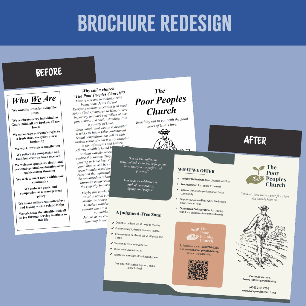
This brochure redesign came out of an earlier connection. I had previously built a website for a recovery curriculum (see Building the Starting Over Site), and not long after, the founding pastor reached out about a separate project for his church.
He had drafted a trifold brochure he wanted to distribute at an upcoming event. The messaging was heartfelt and rich with meaning, and he wanted help shaping it into a format that would be easy to hand out and engage with. I worked closely with him to create a version that preserved the original spirit while making the layout easier to read and the message easier to carry forward. After the brochure was complete, I built a companion website and added a QR code so readers could explore more.
Audience & Context
The brochure was created for outreach and needed to be approachable, clear enough to be shared in public settings, and express the depth and values of the church. The linked website gave more information and another way to connect.
The Problem
The original version carried a strong voice and intent, but it was difficult to absorb at a glance.
- Paragraph-heavy sections made it challenging to scan
- The hierarchy of ideas wasn’t visually clear
- There was no easy way for someone to explore the church further
The Solution & Process
My focus was on creating a clear, organized version that supported the message without softening it.
- I added a simple logo, reflecting the tone and identity of the church
- Built the trifold in Adobe InDesign, formatted for printing with cropmarks and bleeds
- Extracted key themes from original brochure and follow-up discussions to shape grouping and flow
- Created a new supporting website and added a QR code for readers to explore beyond the brochure
Improvements at a Glance
- Visual Structure: Simplified layout with clear sections and bold headers
- Readability: Shifted to left-aligned, sans-serif text with short bullets
- Call to Action: Added website and QR code
- Tone: Used everyday language to help the message land more immediately
- Layout: Introduced whitespace and icons for clarity
The Outcome
The new brochure kept the voice and intent of the original while offering a more scannable reading experience. It gave the pastor something that could be read quickly, and the linked website offered a next step for those who wanted to learn more or connect later.
While the design was a rapid, practical solution built under a deadline, it established a clearer foundation that a designer could take further if the church invests in future iterations.
What Success Looks Like
- The brochure communicates key ideas quickly, even in a casual setting
- People take it home and remember how to follow up
- The website gives a meaningful next step without adding pressure